
High-Converting Checkout Experience in India: A 2026 Guide

Checkout optimization for ecommerce in India is the practice of removing friction — in both the interface and the underlying payment infrastructure — between a customer adding an item to cart and completing payment. It combines UX design (form length, mobile layout, error handling), payment strategy (which methods to offer and how to order them), and payment infrastructure (routing, success-rate monitoring, retry logic) into one measurable system.
That one-sentence definition matters because most checkout advice conflates two separate problems. A customer can abandon because a form was confusing (a UX problem), or because a UPI transaction was initiated and failed at the bank’s end (a payment infrastructure problem). The fix is different in each case, and treating both as “checkout design” is why many optimization efforts stall.
Baymard Institute’s ongoing checkout research puts average cart abandonment at just over 70%, and attributes a meaningful share of it to avoidable usability friction rather than pure browsing behavior. Baymard For Indian merchants specifically, that friction sits on top of a payments landscape that is unusually UPI-heavy, mobile-first, and — as of 2026 — subject to new RBI authentication rules that directly touch the checkout flow.
Quick Answer
Improving checkout conversion in India requires:
(1) a mobile-first, low-field checkout UI
(2) a payment method mix led by UPI but sized to order value and audience
(3) transparent pricing with no late-stage cost surprises
(4) clear recovery flows for failed payments
(5) separate measurement of UX drop-off versus payment failure, since they require different fixes. RBI’s 2026 two-factor authentication mandate and card tokenisation rules add compliance requirements that also affect checkout speed and design.
Why India’s Checkout Environment Is Structurally Different
Three factors make checkout optimization in India distinct from a generic global playbook:
1. UPI dominates transaction volume. NPCI reported 23.66 billion UPI transactions worth ₹29.88 lakh crore in July 2026 — the highest monthly volume on record, up 22% year-on-year in transaction count. NPCI Business Standard A checkout that treats UPI as one option among many, rather than the default path for most mobile shoppers, is starting from a weaker position.
2. Regulation shapes the flow itself, not just the backend. Two RBI rules directly change what a checkout screen can and must do:
- Card tokenization: merchants and payment aggregators are barred from storing raw card details on their own servers; saved-card checkout must run through network-issued tokens instead. HDFC Bank
- Mandatory two-factor authentication for digital payments, effective April 1, 2026, requiring at least one dynamically generated authentication factor per transaction — extending AFA requirements to a wider set of transaction types, including cross-border card-not-present payments. Business Standard
Neither rule is optional, and both affect checkout speed, saved-payment UX, and failure-recovery design. A 2026 checkout strategy that doesn’t account for them is already out of date.
3. Order value changes the right checkout, not just the right payment method. A ₹500 impulse purchase and a ₹50,000 electronics order behave differently at checkout — different willingness to create an account, different appetite for EMI, different sensitivity to extra authentication steps.
The Checkout Stack: Four Layers, Not One
Most checkout advice focuses only on the interface. A more accurate model treats checkout as four layers, each with its own failure modes and its own fix:
| Layer | What it covers | Fails when |
|---|---|---|
| Experience | Layout, form fields, button clarity, information hierarchy | The next action isn’t obvious |
| Trust | Pricing transparency, delivery clarity, security signals | The customer has to guess at cost, timing, or legitimacy |
| Payment Choice | Which methods are offered, and in what order | Preferred method is missing, or too many options cause decision fatigue |
| Payment Intelligence | Routing, success-rate monitoring, failure recovery | A UI-perfect checkout still loses transactions after “Pay Now” is clicked |
The fourth layer is the one most audits skip, and it’s usually where Indian ecommerce businesses lose the most revenue silently — a customer selects UPI, initiates payment, and the transaction fails somewhere between the PSP, the network, and the issuer, with no visibility into why.
Five Places Checkout Optimization Usually Breaks
1. Forms ask for more than the order requires. Baymard’s checkout usability research finds that many sites use substantially more form fields than necessary to complete a purchase. Baymard Fix: autofill, address lookup, and guest checkout by default — account creation as a post-purchase prompt, not a gate.
2. The final price isn’t the price the customer expected. Shipping, taxes, or fees appearing only at the last step is one of the most common reported reasons for abandonment. Fix: show the full payable amount from the cart stage onward.
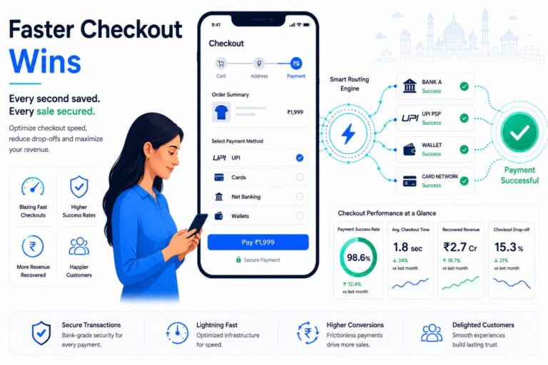
3. Mobile checkout is a shrunk desktop checkout, not a designed one. Typing, app-switching for UPI authentication, and small tap targets all compound on mobile. Fix: numeric keyboards for phone/OTP fields, minimal screen transitions, and UPI intent/collect flows that don’t force the customer to leave the app unnecessarily.
4. A failed payment is treated as a dead end. Failures can be temporary — bank-side timeouts, network drops, authentication interruptions — not necessarily lost intent. Fix: “Payment didn’t go through — try again or choose another method” keeps the customer in the flow, instead of “Payment failed.”
5. UX metrics and payment metrics get measured as one number. A single “conversion rate” can hide two different problems. Fix: separate the funnel into cart → information → shipping → payment selection → payment processing, and track drop-off at each stage independently.
What to Measure
| Category | Track this |
|---|---|
| Funnel | Checkout initiation rate, payment selection rate, order completion rate |
| Payment | Transaction success rate by method, failure reasons, retry success rate |
| Device | Mobile vs. desktop conversion, separately |
| Customer | New vs. returning conversion, conversion by order value |
Google Analytics 4, GTM, and Meta’s Conversion API can attribute funnel drop-off; payment-method and failure-reason data typically has to come from the gateway or orchestration layer itself, which is why UX analytics alone can’t diagnose a payment-infrastructure problem.
Where Payment Infrastructure Fits In
Once the interface is fixed, the remaining friction is usually in what happens after “Pay Now” — and that’s an infrastructure problem, not a design one. This is the layer platforms like FastFlowPe are built for:
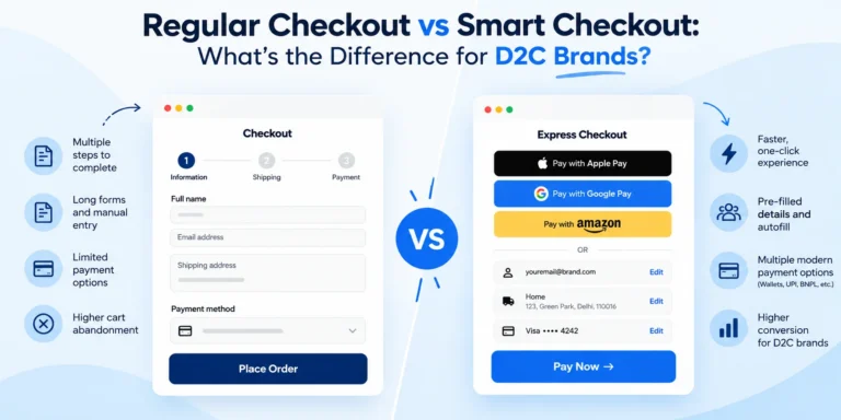
- Smart Checkout — a checkout configured around a merchant’s actual order-value mix and device split, rather than a single generic template.
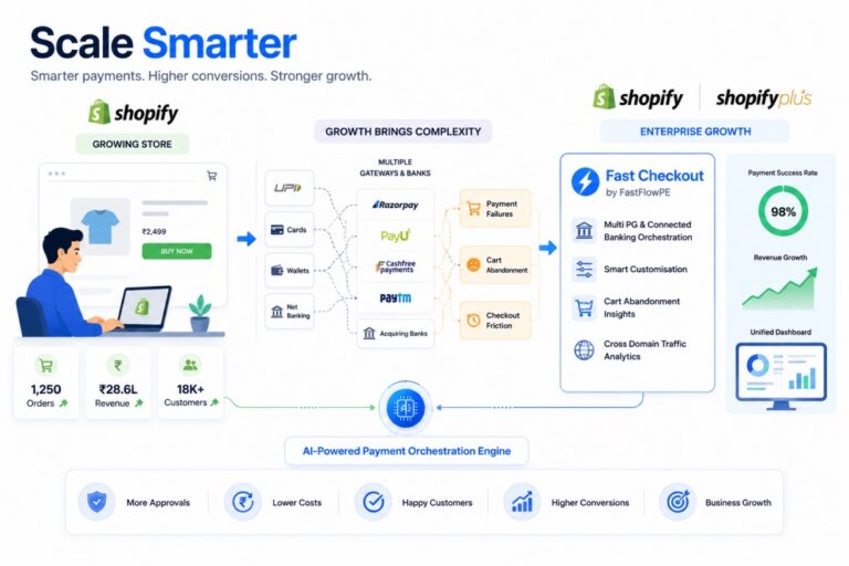
- Payment Orchestration — one integration managing multiple PSPs/gateways instead of a merchant maintaining separate dashboards, reconciliation, and failure logs per partner.
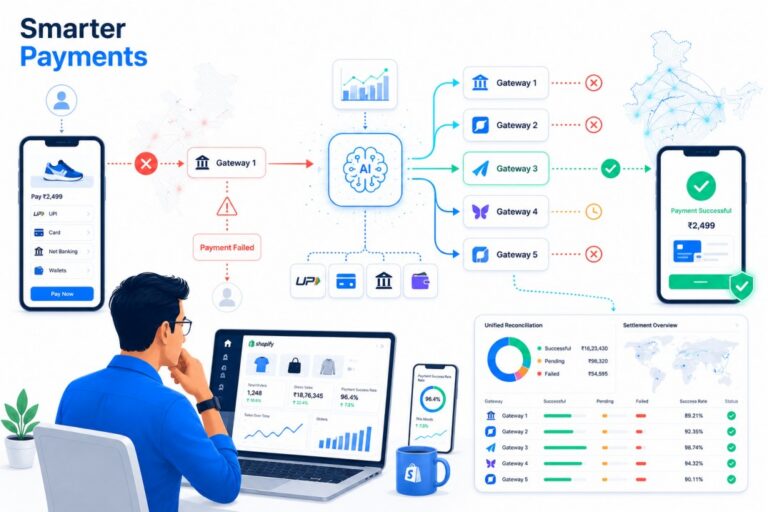
- Smart Routing — sending a transaction to whichever connected payment partner has the best live success rate for that payment method, rather than a single fixed path that fails the same way every time it’s under load.
- Payment Intelligence — surfacing failure reasons and success-rate trends by method, device, and partner, so a merchant can tell whether a drop is a UX issue or a partner-side issue before it compounds.
None of this replaces getting the UX right first — a well-routed payment behind a confusing checkout still won’t convert. But for merchants who’ve already fixed forms, pricing clarity, and mobile layout and are still seeing inconsistent completion rates, the remaining gap is usually visible only at the infrastructure layer, since results always depend on a merchant’s specific traffic, partner mix, and implementation.
Myth vs. Reality
| Myth | Reality |
|---|---|
| Fewer steps always convert better | The right step count depends on order complexity and should be tested, not assumed |
| More payment methods = more conversion | Relevant options convert better than exhaustive ones; excess choice adds decision fatigue |
| A failed payment means a lost customer | A clear retry/alternative-method flow can recover a meaningful share of failures |
| Checkout optimization is a design task | It spans product, engineering, payments, and analytics — not just UI |
Merchant Checklist
- Final payable amount is visible before the last step
- Guest checkout is available by default
- UPI is a first-class option, not buried in a list
- Card checkout is tokenization-compliant, with no raw card storage
- Authentication flow accounts for RBI’s 2026 two-factor requirement
- Failed payments offer retry or an alternative method, with a clear message
- Mobile and desktop conversion are tracked separately
- Payment success rate is tracked by method and by partner, not just overall
FAQ
What is checkout optimization for ecommerce in India? It’s the process of reducing friction across both the checkout interface and the underlying payment infrastructure — form design, mobile usability, payment method mix, and transaction success rates — to convert more shoppers who have already reached checkout.
How can I reduce cart abandonment in ecommerce? Shorten forms to only what’s required, show the full price early, default to guest checkout, and design the mobile flow specifically rather than shrinking the desktop version. Baymard’s research links a meaningful share of abandonment to addressable usability friction rather than pure browsing intent. Baymard
Which payment methods should an Indian ecommerce checkout offer in 2026? UPI should be a default, high-visibility option given its transaction volume. ([NPCI][2]) Cards, net banking, wallets, and EMI (for higher order values) round out the mix — the right combination depends on the merchant’s actual order-value distribution and customer base, not a generic list.
How does payment routing affect checkout conversion? The checkout UI is only the customer-facing half of the transaction. A payment attempt can still fail after the customer clicks “Pay” due to issues at the gateway, acquirer, or issuer level. Routing a transaction to the best-performing available partner, and monitoring success rates by method, can recover conversions a UI-only audit won’t catch.
Does RBI’s two-factor authentication rule affect checkout design? Yes. From April 1, 2026, RBI requires at least one dynamically generated authentication factor for digital payments, which extends AFA requirements to a broader set of transactions. Checkout flows need to account for this step without adding unnecessary friction. ([Business Standard][5])
How often should checkout be optimized? Continuously. Customer behavior, payment-method preferences, device mix, and regulatory requirements (like the 2026 authentication rules) all change — a checkout audited once at launch will drift out of date.
Conclusion
A high-converting checkout isn’t one redesign — it’s the ongoing discipline of separating UX friction from payment friction and fixing each with the right tool. In India specifically, that means designing around UPI’s scale, building for mobile as the default rather than the exception, and staying current with RBI’s tokenization and authentication requirements as they roll out through 2026.
Getting a customer to checkout is the easier half of the job. Getting the payment to actually complete — reliably, across methods, devices, and partners — is where the remaining conversion is usually still sitting.